This is the first draft drawing of my front cover. i like the writing but will try and change it to a more cleanly cut one. i will probably use an image similar to this one of Alex as i like the simplicity of it and the fact it lets the audience know who he is straight away, as opposed to an action shot. I quite like the layout, as it makes the magazine stand out more and seem louder as it is slightly messy but to a controlled point. I will have Alex's head over the writing to give the magazine a more established feel, as it will look more proffesional.
I also like the button telling that gives us info about the issue and price. As it fills up a gap that may otherwise look quite unproffesional. The banner across the top is quite simple therefore not taking attention away from the image.
I like the contents page, i beliueve when created properly it will look quite proffesional. I again think the button is quite a good space filler and will probably use the same writing as i did for the front cover for this page. I like the simplistic layout of the content and page numbers. and the competition information on the side wouldmake a reader want to read on as it does not give too much away. I will try and use the same basic images for the contents as i have drawn them as i think they too will look quite proffesional, making people want to read the magazine as it wont look taccy.
Tuesday, 13 December 2011
Monday, 12 December 2011
Name of the Magazine
I asked a few people for names for my magazine and hear are a list that i especially liked;
Grime Weekly,
Grimey,
Grime Time,
and Global Grime.
i really like these ones in particular and and on asking a few more people to pick between these, i decided on the name 'Grime Time' which was originally the one that i most prefered but though i would ask more people to make a magazine that would appeal directly to them.
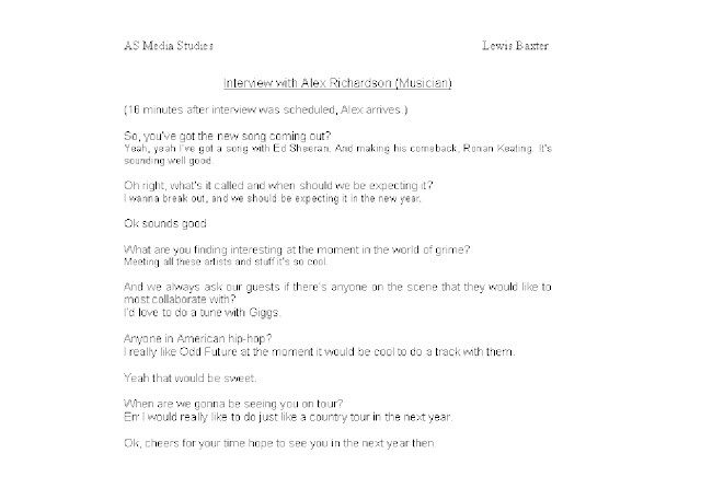
I decided that i will be doing my interview about grime and will be interviewing up and coming music star Alex Richardson.This is the interview with Alex Richardson that i will be using for my douple page spread also featuring other info and pictures of the artist. The page will only show this content as i dont want it to be too messy and un organised.
Monday, 5 December 2011
This is the first of my questionnares, filled out and signed by Harry Branton. He chose the genre Grime the
colour gold the price of £1.00 and various content.
This is my second questionnare filled in and signed by Lara Gavin. She chose Indie, but opted for the colour green. And was willing to pay upto £3.50 he also chose more than one content option.
The third qustionnare filled out and signed by Sam Holliday. He again chose grime making it now the leader.
And also the colour green making that the leader. The price again £3.50 making this the leader. And again various content.
Dominic Stirling fillede out and signed this questionnare. Chosing hip-hop leaving grime as the leader and the genre i will base my magazine on. He also chose green making it even further the leader and the colour i will use. He chose £1.00 so i will choose a price inbetween £3.50 and £1.00 such as £2.50. Most people chose Interviews and reviews. I will put both into my magazine along with competitions and prizes.
R: 31 G: 101 B: 1 My colour scheme will be a dark green with white lettering. I believe people picked this colour because it can be related to money and the world of money is closely intergated with the world of music. It may also make them think that the magazine is quite glamarous. I like this particular colour because it is quite rich and may convey these messages more clearly. The people in my target audience ages 14-25 may like this as they are quite early in there lives and this could link to what they wouldlike to have in the future.
I think the white lettering that i will be using will stand will make the magazine stand out amongst others.
Subscribe to:
Comments (Atom)


